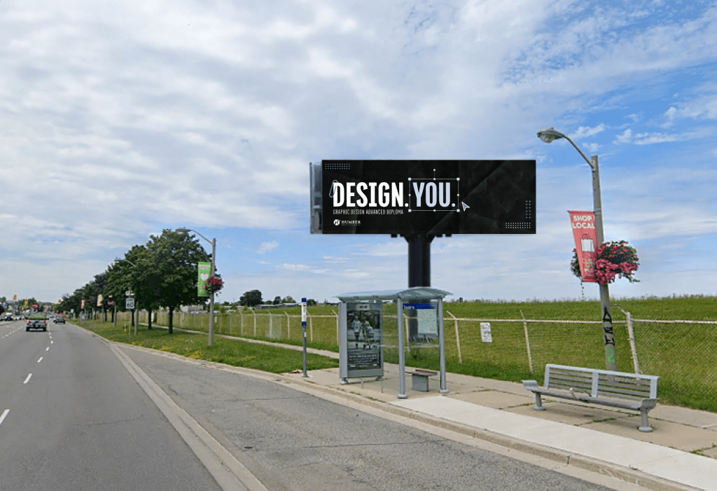
The Problem: A premium digital billboard placement was up for grabs. Only one program could win it. The constraints were brutal: 2-second read time at highway speed, 80–100 km/h, zero clutter, full brand compliance.
The creative challenge was psychological. Prospective students felt creative but doubted they were ready for an advanced program. The billboard had to answer a question they weren’t even asking yet: “Is this for someone like me?”
The Insight: In competitive, high-constraint environments, clarity beats creativity. A single strong idea, executed with radical legibility, will outperform visual noise.
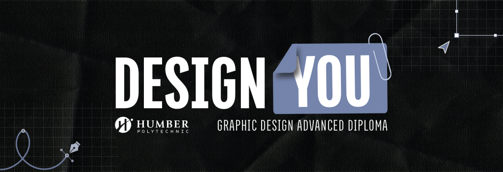
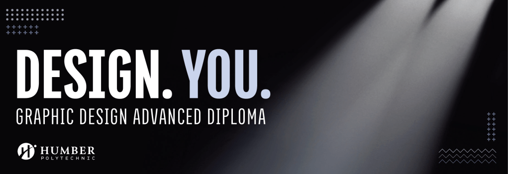
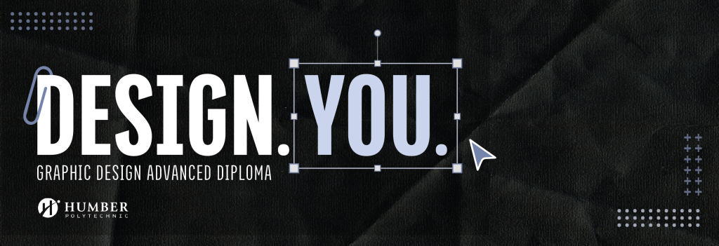
What I Did: I pushed the creative team away from abstract, decorative concepts toward pure typography and hierarchy. The result was “DESIGN. YOU.” — 2 copies that said everything:
- You can design.
- This program is for you.
- Apply now.
The system used Titular Heavy headlines, high-contrast black and white against Humber blue, and subtle visual references to design thinking (grids, frames). No decoration. No competing messages. Just enough personality to feel confident and modern, enough clarity to be understood in seconds.
Why It Mattered: This shows how to lead creative work under tight constraints. Constraints don’t limit creativity, they focus it. It also shows understanding of audience psychology: prospect fear isn’t overcome by pretty visuals. It’s overcome by clarity that says, “Yes, this is for you.”
Disclaimer: Unfortunately, we did not win. But it was a great learning experience!
